Raymond Nakamura & Katrina Vera Wong, Multimedia editors
The COVID-19 pandemic has highlighted the need for effective science communication (among other things) and science communicators and artists are finding ways to meet this demand. How does the novelty and urgency of the current situation affect the creation of multimedia that communicates the relevant science? We asked some practitioners in Canada about their experiences.
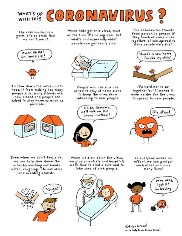
Visual information has an immediate impact on most people. Images can quickly convey not only ideas but tone. This is demonstrated by author and illustrator Elise Gravel’s downloadable poster titled “What’s Up With This Coronavirus?” (available in English and French). She said, “I like to create comics to explain situations to kids when I feel resources are lacking. This was one of them.”
Gravel has written and illustrated many amusing and instructive books for children, including the Disgusting Critters series, which describes creepy creatures like The Cockroach.
In her coronavirus poster, she has created simple, playful images that are inviting and easy to follow. They are accompanied by friendly and inclusive text.
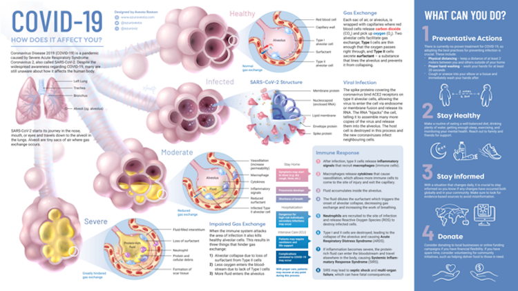
Scientific animator and illustrator Avesta Rastan created a poster on the science behind COVID-19, which you can download from her website. She said, “In the early days of the pandemic, I noticed a clear lack of visual media that showed how the virus actually affects someone. There was an overwhelming amount of information and articles being released daily, but I imagined it would be incredibly difficult for someone from a non-science background to sort through it all and know what to believe. With my professional training in medical illustration, I thought I was uniquely suited to tackle this issue and create an infographic that could help summarize COVID-19 information, combat misinformation, and educate a lay audience.”
Rastan worked on the poster in the spring just after the pandemic became serious in North America. She said, “I felt pressured to get it out as soon as possible since there was new media being released every day. At the time, I was working full-time at a medical communications company and was doing this as a side project, so it was hard to find the time to work on it.”
Originally posted on Twitter and recently published in Discover magazine, this beautifully designed and informative poster details the internal effects of the SARS-CoV-2 virus on human lungs. It shows the sequence of events that occur in the body after it becomes infected with COVID-19. With crystal-clear aesthetic and precise language, realistic illustrations like this can come across as trustworthy, like something you might see in your doctor’s office.
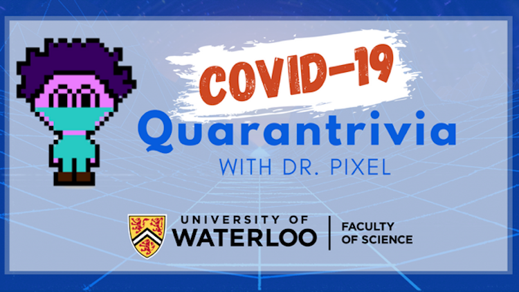
University of Waterloo science student Ridhi Patel created an educational game called COVID-19 Quarantrivia with Dr. Pixel to test your knowledge and understanding of the virus. You can try it out on the university’s website.
“At first, I was thinking that this game could be a fun and important educational tool for children to use at home as schools had been closed temporarily,” she said. “However, as the pandemic progressed, misinformation was becoming a much bigger problem to deal with across all demographics, and it is still a rapidly growing problem with devastating effects on multiple lives.”
The game’s pixelated, animated image of a masked Dr. Pixel comes across as cute and friendly, while the association with the Faculty of Science at the University of Waterloo establishes its credibility. Patel said, “Through Quarantrivia, our goal is to provide clear, concise and factual information that anyone with a decent internet connection, and some time, can access and read/play through.”
Consisting of increasingly difficult sets of multiple-choice questions, the game rewards correct answers with hurrahs. But answer incorrectly and an animated virus threatens Dr. Pixel’s ability to save crying Little Pixel (and the Pixel World!).
The game doesn’t end after three strikes (wrong answers), however. You can continue with the trivia, but the result is already clear: You and Dr. Pixel need to try again. Give it a whirl and share your score in the comments below the game.
Patel had to deal with technological issues while developing Quarantrivia – her laptop stopped working, and a programming partner became unable to participate.
Still, she carried on. “I was also very skeptical of receiving any credible support when I had first thought of this project, or of it having any real impact, but was pleasantly surprised at the response from the faculty and the community throughout!”
INVIVO is a science communications company based in Toronto. They created a mesmerizing computer-animated video about the science of soap and how washing hands gets rid of viruses at the molecular level.
According to INVIVO Marketing Manager, Glendon Mellow, “The novel coronavirus is scary, especially so at the start of the pandemic, so we wanted to help people understand it. We chose to demonstrate two remarkable ways ordinary soap can destroy the virus.”
But Mellow points out, “The lead time on creating a new medical animation can be long, so first we had to see if the team had the capacity to take this on. Everyone was excited to work on it, from our medical writers to 3D animators.”
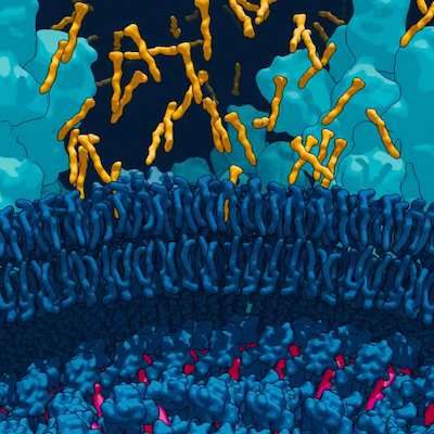
Soap surfactants penetrate SARS-CoV-2 virus membrane from COVID-19, and The Science of Soap; used with permission from INVIVO
They also had practical considerations. According to Mellow, the INVIVO team asked themselves, “What did we know about SARS-CoV-2 back in the winter that would still be relevant weeks later when we finished the animation?” After some collective handwringing, they decided to work on the science of handwashing.
“Soap can destroy other viruses, such as the flu, in the same way as the novel coronavirus,” Mellow said. “And the science behind the everyday activity of washing our hands isn’t widely understood, so we felt this was a good place to put our energy – it wouldn’t become outdated as understanding of this virus evolved.”
In the process of creating the video, they also developed a different visual style that they call “toon-shading.” Mellow said, “We’re extremely pleased at the response we’ve gotten for it! We carried the visual style over to our HoloLens 2 mixed reality project, the Coronavirus Explorer.”
These projects are all engaging, but the creators were also concerned that the information be as factually correct as possible. For example, Gravel consulted some of her scientist friends regarding her content. (She’s also added a poster on how to wear a mask.) Patel worked with virus ecologist Dr. Jozef Nissimov, who said, “My role was mainly to make sure that the information given in the game was scientifically sound and in accordance with current government and WHO advice.” INVIVO uses science writers with advanced degrees to research projects.
Maintaining accuracy is particularly challenging for COVID-19 because scientists are discovering new things about the virus all the time. This is the way real science works, although many people seem to expect a bunch of unchanging facts.
As new information comes to light, Rastan updates the image available on her website. Patel is changing schools to stay closer to her family but says that “the game will be kept up-to-date with current circumstances as long as the pandemic and the misinformation around it continues to threaten our collective health and safety.”
Mellow observed that handwashing is still important. He notes that the transmission of the virus from surfaces seems to be relatively low and “it may have been interesting to include a short sequence on the effectiveness of masks, or a safety comparison of indoor-versus-outdoor transmission.”
As the pandemic continues, various forms of science communication will certainly play an important role in helping us understand and overcome COVID-19. If you know of other good examples of COVID-19-related sciart, please include them in the comments below.
~30~
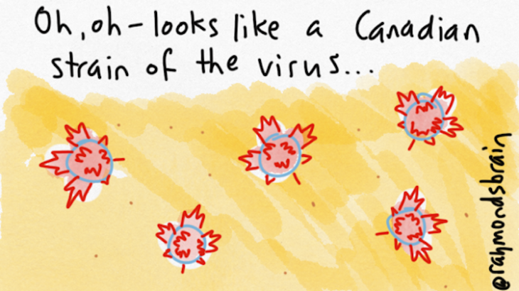
Banner image © Raymond’s Brain (Raymond Nakamura)

