
Katrina Wong and Raymond Nakamura, Multimedia co-editors
Jen Burgess applies her background in biology and art as a freelance science illustrator based in Vancouver. We caught up with her via email to learn more about her work, how it facilitates science communication, and why it’s easy on the nose.
Science Borealis: In art, written or visual, it’s impossible to fully replicate what we see. Some artists look inwards for justification to use nature in their art. You seem to pay close attention to realism in your illustrations. Why is that?
Jen Burgess: My artwork is more about exploration and learning about the world, rather than my own emotional expression. I use nature by default, and find that my creativity lies within the parameters of problem solving. I feel I need to justify using abstraction or impressionism, anything besides realism.
Exact replication is what photography is for. Even then, it is filtered through the eye of the photographer and post-processing. What you see in a realistic illustration is also filtered through the eyes and brain and hands of the artist. Even if it’s photo-realistic, it’s never an exact replication. Every twig and hair is not drawn, just the overall impression. Details are filtered out until we are left with only what we need to see. Often many sources are used to composite an illustration that looks real but never actually existed.
In science illustration, accuracy is what’s most important. It’s important to get proportions, shadows, textures right. These skills have to be kept fresh, so sometimes we have to just “copy” something just for the sake of keeping those neural pathways working.
SB: Your black & white illustrations seem more detailed than your coloured ones. How do you decide whether or not to portray something in black & white or colour?
JB: I hadn’t noticed that in my own work, but you’re right, and it makes sense! It’s usually just intuitive (or what a client is asking for). Even my highly-detailed colour pieces tend to fall into a monochromatic colour scheme, like the nest or shipwreck, staying within the browns.
In school, we often said, “Value does all the work, but colour takes all the credit.” If a colour piece looks amazing, it’s because it has enough dark and light values contrasting in all the right places. However, matching colours with traditional paint media is a lot of work, so I suppose when we leave out the colour and are left only with grey scale values, there’s room for detail without spending extra time and energy on a project and potentially leaving the viewer overwhelmed.
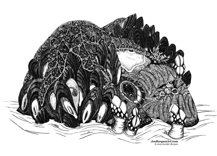
Intertidal Invertebrates. © Jennifer Burgess 2015
SB: You work with a variety of media. Do you have any preferences? Does one form of media work better for a particular subject, for instance?
JB: My first love has to be watercolour. It works well for botanical subjects, as does pen and ink, which is most traditional. In my science illustration program, I was introduced to gouache (opaque watercolour) and coloured pencil on duralene film. Both of those are forgiving and therefore so amazing! Digital is probably what I use most often now, and my style is starting to combine traditional media with digital. Sometimes I feel that [as a] generalist I may not improve as much as I would like to across all the media I use. You have to practice to keep skills sharp, and I feel like I need to put all [these] media in a rotation.
SB: Your website shows how much you value sketches and field notebooks. What can you tell us about how you developed yours? Do you have any tips for anyone getting into the practice?
JB: John Muir Laws (Jack) was a big influence on me. I took a workshop with him and then joined his Nature Journal Club when I was in California. It was amazing to have other people out sketching at the same time, for mutual moral support. One of Jack’s biggest tips was that we are just recording data. Write down the date, the location, maybe a few observations on the weather, before you even start sketching. Then it’s not a blank page. If you feel like you’ve messed up a sketch, just start adding labels and arrows and some writing. Then it looks like an informative diagram rather than a pretty picture. I recommend anyone to pick up one of his books for inspiration.
SB: What is your favourite page in your sketchbook? Why?
JB: With equal parts adoration and hatred, it has to be the first page. It’s so wonderful and terrifying to start a new book. So I often just scribble all over it. I test colours, write my name, doodle something stupid. Sometimes I’ve even straight up torn it out. Then the book isn’t perfect, and I move forward.
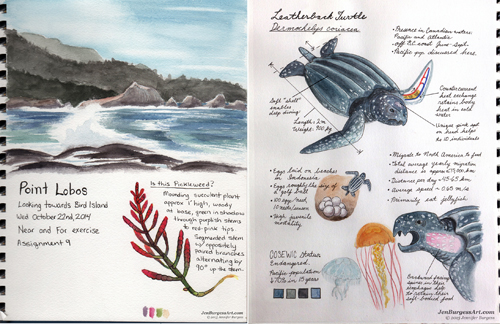
Page from sketchbook. © Jennifer Burgess
SB: What made you realize they didn’t have to be perfect?
JB: When I started really filling up sketchbooks, the imperfections showed a great deal of learning. I appreciate this early work because I can see how far I’ve come. Later, when I learned to paint realistically, we were encouraged to show the imperfections in our subjects, because they were charming and beautiful. And doesn’t that hold true for people as well? Don’t you love laugh lines around someone’s eyes? That said, it’s all still an emotional process and we all have our setbacks. The important thing is to just keep pushing forward.
SB: What are some advantages and disadvantages of working as a freelance science artist?
JB: It’s both an advantage and disadvantage that work is sporadic. Sometimes that means I don’t have a weekend and stay up late working to meet deadlines, but other times, I have a couple of weeks free. An advantage is definitely that I get to use my niche set of skills to serve the scientific community, but a disadvantage is that since I’ve made art my career, when I am inspired to create something for my own purposes, it still seems like “work.”
SB: What has been your greatest challenge, as an individual and as a collaborator? Why and how did you overcome it?
JB: As an individual, probably working for myself and learning the business side of freelancing. It’s isolating work, so sometimes if it’s not a messy paint day, I will go to a coffee shop to work around people, or co-work with another freelancing or student friend. Volunteering in a meaningful way and keeping up a social hobby have also helped me avoid isolation. And I’ve learned to outsource business aspects like taxes, website, branding, etc., and to spend some of my downtime reading up on the process and managing what I can.
As a collaborator, sometimes being constrained by the wishes of the client for budgetary or practical reasons, my otherwise great idea just won’t work for a project. What I want to do given unlimited time and money can’t happen, so I have to do what is possible. Often that is a good thing. The other hard thing is the client’s right to first publication. If I posted to my portfolio before my client publishes their paper, it wouldn’t go over well. So often I have to sit on something for months before it gets published. I’m not sure there’s much of a way around that other than producing work for my own sake. I’ve been looking at Patreon (creative subscription service) lately and wondering if that will be a good fit.
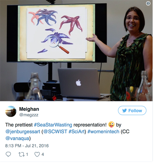
Jen Burgess presents at SCWIST, 2016. Photo by Meighan Makarchuk, Vancouver Aquarium @megzzz
SB: Last year, you presented “Sea Stars Go Viral” at a SCWIST event. What role can SciArt play in improving science communication?
JB: I was giving a general talk on the topic of science illustration and presented this piece as an example of my work. It was originally a school project to accompany a published article by the same name on sea star wasting syndrome by science writer Leslie Willoughby for CSU Monterey Bay’s sister program at UC Santa Cruz.
At this talk, we joked that one of the roles SciArt fills is being less smelly than dying sea stars in person! (I think that’s what I was laughing about in this candid photo). Similarly, it’s easier and more pleasant for the general public to look at an illustration rather than photos of rotting-while-still-alive invertebrates or internal organs. Overall, an illustration will catch someone’s eye. They will stay with the illustration for longer than a photo, hopefully get the gist of the topic, and be more tempted to read the article for more information.
All scientists face the push to get their work in front of as many eyes as possible. Science communication could be improved if the scientists who’d prefer to continue focussing their efforts on science would hire a communicator and/or artist with scientific training. Funding is often the issue. I recommend a scientist budget in their grant proposals for a science illustrator or communicator to help with promotion of the research.
✦
See more of Burgess’s work here.
All images courtesy of Jen Burgess.